asgoodasnew
UX/UI Design

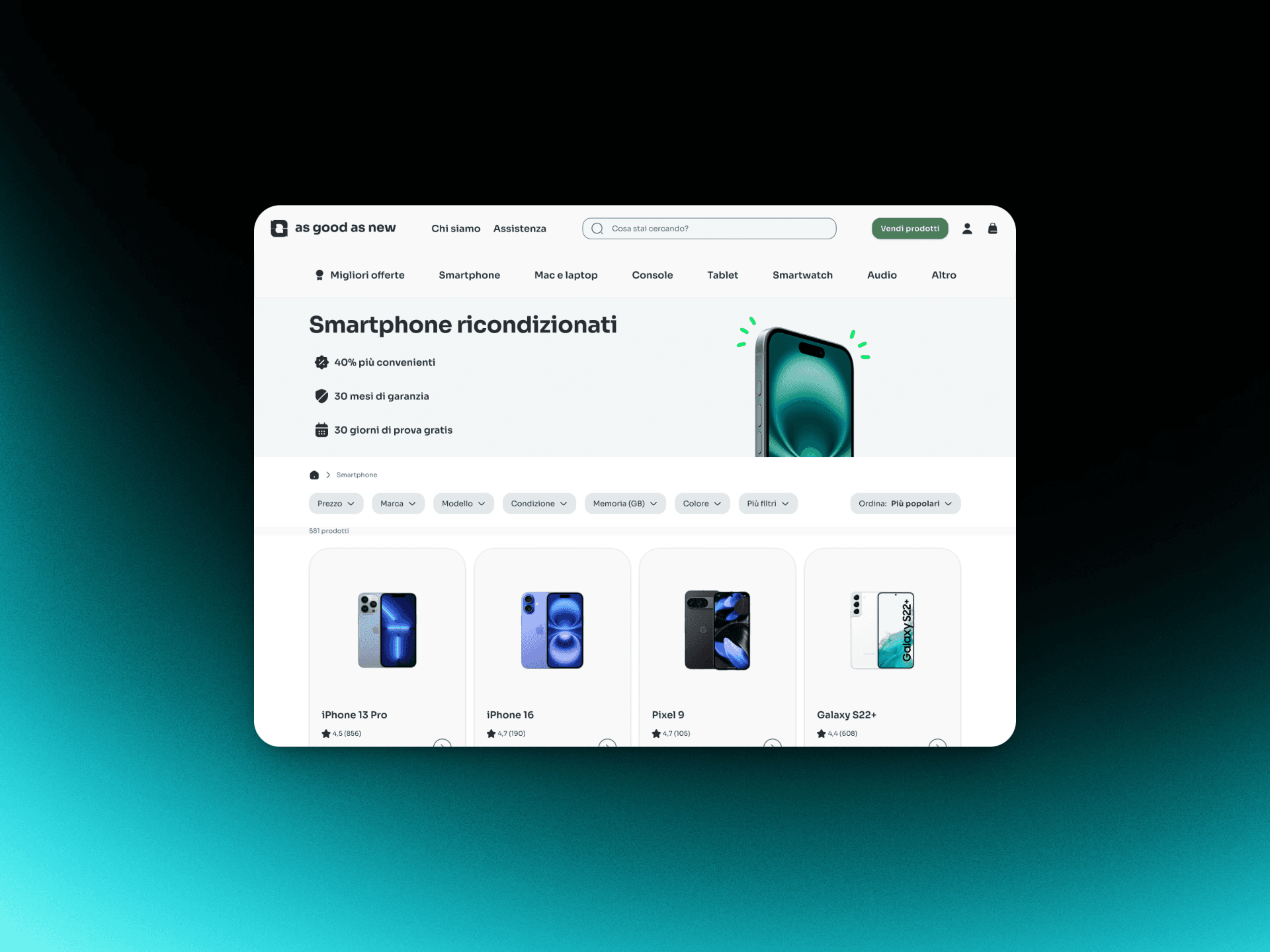
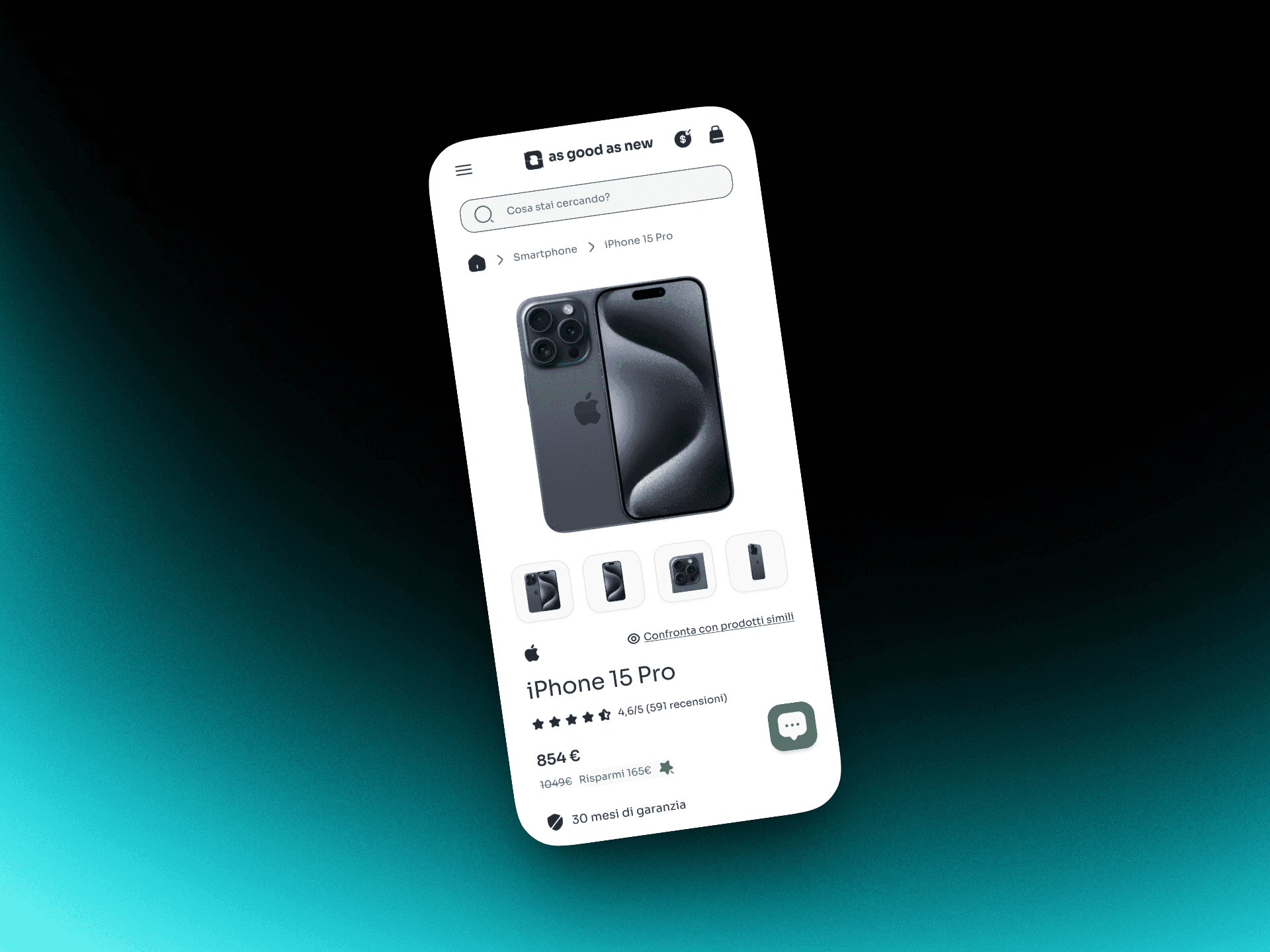
I led a full UX/UI redesign and rebrand for asgoodasnew.it, an e‑commerce focused on refurbished tech. The objective was to deliver a modern, trustworthy experience that clearly expresses the brand’s values—quality, sustainability, and affordability. Beyond aesthetics, the work was designed to rebuild confidence in refurbished products through clear user flows and purposeful visual storytelling. Every choice was deliberate: typographic hierarchy for scannability, a soft neutral base with clean greens to signal eco‑consciousness, and structured layouts with generous spacing to boost clarity and perceived reliability. The result is an interface that communicates professionalism and purpose from the very first interaction.
Client:
asgoodasnew
Role:
Brand & UX/UI Designer
Year:
2025
Challenge
The legacy site showed a dated UI, inconsistent navigation, and gaps in core e‑commerce features, which made it hard to find information, compare products, and complete checkout efficiently. Usability and accessibility issues—unclear hierarchy, low contrast, weak focus states, and limited keyboard support—further disrupted the journey. Brand identity felt generic and failed to express the company’s values, while doubts about product quality and warranty transparency eroded trust. To address this, I conducted a full UX audit and competitor analysis. The research surfaced friction points such as ambiguous IA, pattern inconsistency, and weak trust signals (buried warranty details, scarce reviews, and low‑visibility guarantees). These insights shaped the redesign strategy.
Objective
Create an intuitive, accessible, and visually coherent experience that builds trust and simplifies navigation, while reflecting asgoodasnew’s commitment to sustainability and reliability—and ultimately improving engagement and conversion. This required rethinking the information architecture to streamline discovery, strengthening filtering and comparison flows, and ensuring a consistent brand message across touchpoints. The rebrand established a design language that balances modern aesthetics with functional clarity: clean, legible typography, consistent grids, and a WCAG‑compliant color palette, all contributing to a more inclusive experience.
Results
The final delivery included a fully redesigned and rebranded website prototype with a new logo, type system, and accessible color scheme. User testing produced highly positive feedback, with participants describing the interface as “professional,” “clear,” and “trustworthy.” Following usability tests, the live chat and product comparison features were made more prominent, small but impactful adjustments that improved engagement and reduced hesitation during the decision process. Overall, the project repositioned asgoodasnew.it as a credible, modern platform in the refurbished tech market. Beyond visual improvements, it demonstrated measurable impact on user perception and flow efficiency. The experience also reinforced a key belief: great design emerges from a process grounded in research, iteration, and storytelling, where every detail contributes to both brand integrity and user confidence.