Buddhify
UX/UI Design

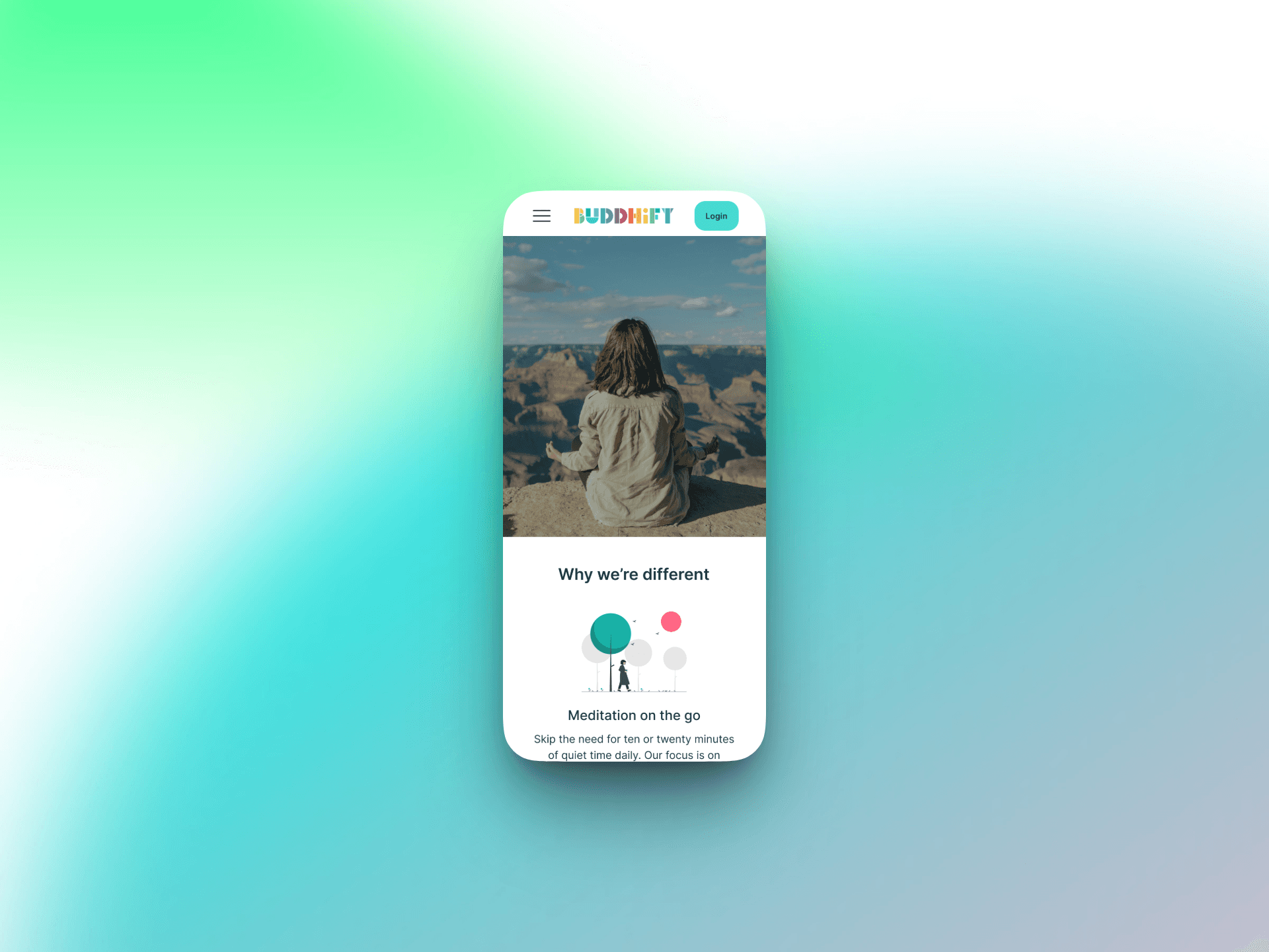
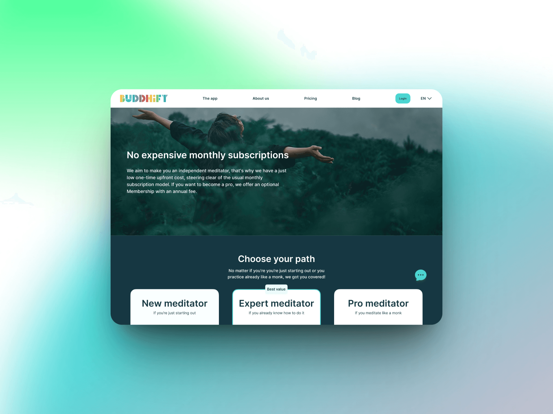
This case study details my Buddhify website redesign. The project’s goal was to help people integrate meditation into busy lives. The process involved a full site analysis, deep user research, and a primary focus on accessibility. I created high-fidelity wireframes and interactive prototypes for desktop and mobile platforms. Buddhify's independent, human-centered approach inspired the work. The design focused on usability and creating an emotional connection. The redesign followed five phases: discovery, accessibility assessment, wireframing, interface design, and user testing. All design decisions were data-driven and centered on clear user needs.
Client:
Buddhify
Role:
UX/UI Designer
Year:
2024
Challenge
The original Buddhify website had major usability and accessibility flaws. These problems harmed navigation and the user experience. The menu was partially not functional. Visuals were inconsistent. The content hierarchy was unclear. The site also lacked key accessibility features. The site architecture was confusing. Users could not find certain pages. Links were duplicated in the header and menu. The mobile site had no sticky menu, making navigation difficult. The absence of a free trial option also limited new user acquisition and engagement. I used heuristic evaluation and competitor analysis to find areas for improvement. The discovery phase showed a need to simplify navigation, unify the visual style, and create clearer calls to action.
Objective
The primary objective was to fix all major usability and accessibility issues. The redesign sought to improve navigation, efficiency, and error prevention. It also made the experience more inclusive. I restructured the information architecture and designed a clearer sitemap. Accessibility was a core focus. I created personas for users with visual, motor, and learning disabilities to guide design decisions. Key goals included full keyboard navigation, screen reader compatibility, and optimized contrast ratios. I also added clear interaction feedback. The new design communicates calmness and simplicity, aligning with Buddhify's brand mission.
Results
The project culminated in a complete high-fidelity prototype for both desktop and mobile versions of the Buddhify website. The new sitemap, wireflows, and interface layouts created a smoother, more logical experience supported by consistent design patterns and improved accessibility. User testing played a crucial role in validating these improvements. A 5-second test on the homepage confirmed that all participants immediately recognized the purpose of the site as a meditation platform. Users described the design as “calm,” “clear,” and “aesthetically pleasing.” Minor adjustments were made based on feedback, such as refining the “Featured by” section and slightly enhancing visual balance to improve clarity. Overall, the redesign successfully repositioned Buddhify as a more accessible, user-friendly, and trustworthy brand, reflecting the app’s mission to bring mindfulness into everyday life. The project also reinforced the importance of an iterative process where accessibility, empathy, and visual consistency work together to create meaningful digital experiences.